I’m also going to be drawing custom cursed objects for anyone who stops by:
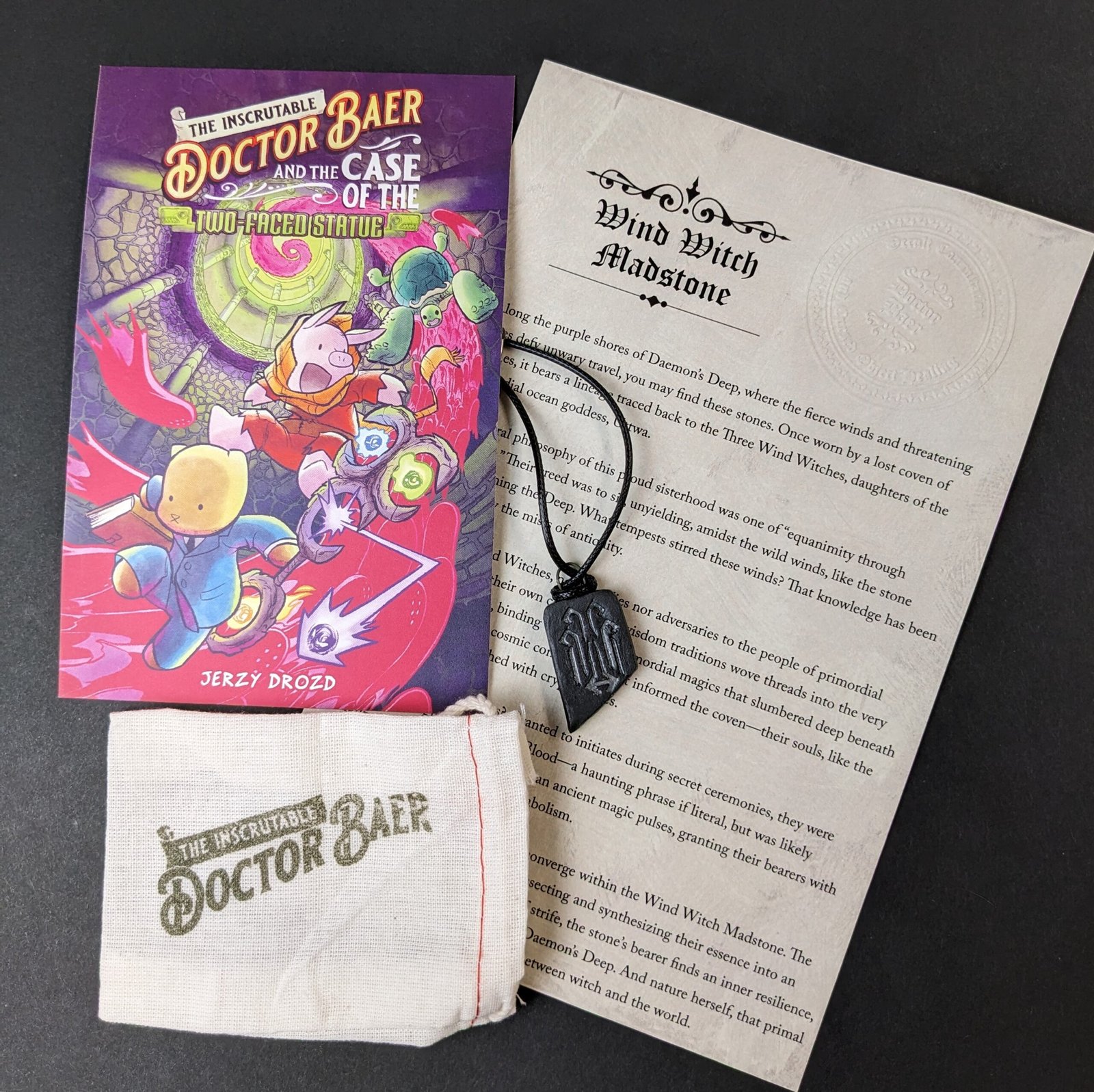
And you’ll be able to get some of the first Doctor Baer talismans! These ceramic objects are in-world artifacts you’d find if you visited Doctor Baer’s spooky home.
I just got the advance reader copy of The Inscrutable Doctor Baer and the Case of the Two-Faced Statue!
It’s hard to articulate the emotions I felt holding this artifact of two years’ worth of effort in my hands.
Which got me thinking about this Thought/Question/Wondering from the Doctor Baer AMA:
Do you ever feel the tension between protecting time to work on your book against time that friends and family want you to spend with them? What does that look like, and how on earth do we find the best balance in this (that’ll bring the least amount of guilt, ha!) ?
So I take some time to explore the tensions between us and the world when we set out to make art.
The Inscrutable Doctor Baer and the Case of the Two-Faced Statue is now available for preorder on Indiebound and Amazon, so I think that counts as a cover reveal!
So let’s take a look at some of the concepts I created to find the final cover design. Please note that these were all made before I had to change the character’s name:
This was my favorite one. I liked the journey into mystery, with the threatening face on the cave’s mouth behind them. As if to say they might not know the danger they’re walking into. Very Duck Tales-ish.
The Indiana Jones movie poster version.
An adaptation of the original teaser image, I felt like this one reflected the types of covers found on readalikes. Kind of a movie poster, but the details are dialed back for clarity.
By the time I got to the 4th sketch, I felt like I was out of ideas. Feeling a little urgency to finish with at least 5 concepts, I sketched out a spiral that would lead to the title. I didn’t know what I was going to do with it, but practice has shown me that putting something on the page to respond to often works. This moment doesn’t happen in the book, but it sums up the vibe pretty well. So well, in fact, that my editor said this was the cover we needed to go with!
Just selling the tone of playful, spooky adventure with this one.
This one has a lot of storytelling in it. But I think it would work better for a monthly comic than a graphic novel.
And one more take at the fifth sketch with a different color scheme.
I liked them all, but I think my editor was right to pick number four. It passes the squint test, the pink ghosts really pop, and the heroes are descending into unknown danger. Which one would you have chosen?
I know a big part of how you advocate for comics and a thing you’ve shared that brings you a lot of joy is the teaching part of what you do– teaching comics. Through the long journey that is making a graphic novel, do you find that you pick up new tidbits/angles/perspectives/lessons that you can apply to teaching your students in the classroom?
Whether or not you’re planning on working with students, reflecting on your artistic experience only enriches it. But I also share how it leads to teachable moments and lessons plans that are fun for beginners.
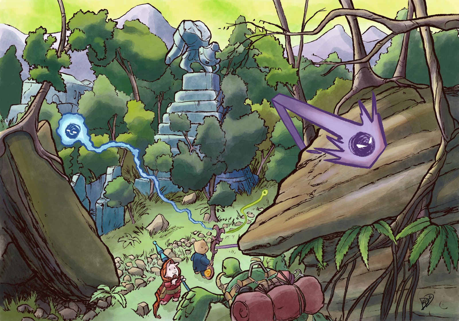
It took me a few months to get to it, but I finally painted the Doctor Baer piece I started in October.
This was another experiment painting in Procreate. I purchased Nathan Brown’s Procreate Brushes, which I feel do a pretty good job of replicating natural media. But I still haven’t quite found a procedure that feels as comfortable to me as coloring in Clip Studio Paint. There are a few assumptions Procreate makes that CSP doesn’t, which slows me down when painting.
I could be wrong, but it feels to me like Procreate assumes you’re going to work with multiple layers to manage your flat colors. In other words, the house wall flats would be on one layer, the shutters/window sashes on another, the ghosts on another, trees on another, and so on. For the past decade or more I’ve worked with my flats on one layer, with a painting layer above. In CSP I could set the Magic Wand tool to select all instances of a certain color on the layer, then go to the painting layer and get to work. I haven’t found a way to select all of one color on a layer in Procreate unless it’s the only color on a layer. This meant I had to select each little piece of the house walls one by one in order to select the whole thing and give it a wash of color. That added a lot of time and got frustrating really fast.
Another Procreate assumption: You want the brush tool active immediately after using the Selection tool, and you don’t want to edit selections after they’re made. There were a number of times where I’d realize I hadn’t selected every piece of an element, and when I’d undo it would keep the painting mode active while undoing the selections I made. In other words, I could undo my selections, but I couldn’t edit my selections once I went into painting mode. and when I’d undo the selections altogether the tool would default to the paint brush. In CSP the selection tool would remain the active tool until I switched to the brush. I made more than a few unwanted paint strokes on the canvas, assuming I still had the selection tool active. Then I’d have to undo the paint stroke, tap the selection tool, and start again. Which added more time and frustration.
It’s clear to me that Procreate has a very different approach to solving a digital artist’s problems, and I need more practice to internalize the app’s assumptions. I think I saw some quick mask tutorials on Procreate, and I wonder if learning that could help with my flats frustrations. Or I just change my approach altogether and flat on multiple layers!
When I was a teen my art teachers and guidance counselors recommended I didn’t go to art school. Those schools were for people who make real art, like painting, sculpture, fiber arts, etc. I wanted to be a comics artist, which they told me was commercial art (and it was probably my own lack of self-esteem, but I always received their tone as condescending).
For years I wore the commercial art label with a sort of transgressive or subversive pride. I was always ready to correct people if they told me I was a good artist. I’m a capable illustrator or cartoonist, but I don’t make art, I would tell them. If making art that everyone could enjoy is commercial, then I would lean into that. What I didn’t realize is that I was also swallowing an assumption that other arts were off limits to me. My wife Anne almost had to drag me to a watercolor class. That, too, was something I had internally decided was the purview of real artists, not commercial artists like me.
Funny how those early experiences and unexamined assumptions can affect the rest of your life! It turned out I loved working in watercolor, and it wound up informing the look of The Two-Faced Statue.
A lot changed in me internally after moving to Columbus. When I’ve had more time to reflect on it all I’ll share some of it here. But the gist is that I started to relax my grip on the identity as a cartoonist (or commercial artist). It started to become something provisional, not definitional. And with that relaxation came a growing comfort with allowing the word artist in my vocabulary.
So now I’m having a ball exploring ceramics. Playfully making objects as if I visited the world of Doctor Baer and brought something back home with me.
My first batch were these talismans:
I started with some 3D printed stamps based on the mystical alphabet I developed ages ago:
I stamped them into the clay, then put some more marks on the objects using an underglaze. I can’t wait to see how these turn out after firing.
Here’s the menu I designed for her Cafe, wherein you can find the logo on the mug:
And more test talismans:
Right now I have no expectations as to what these objects will become. Products for a store? Things to display on my table during signings/events? Gifts to give to my relatives? They might be simply objects for me to enjoy. It’s not important to me right now. What is important is that, for the first time in a long time, I’m letting myself play with art again. No expectation or purpose, like I did when I was a kid. And it’s been a lovely experience.
While the first print test of a 3″ tall Doctor Baer figurine came out okay, it’s clear I need to make some adjustments to the design, and level up my slicing software skills.
Adjustments I’m making going forward:
The staff is too thin and the Wisps’ connection to the staff are too fragile. Orange and Violet snapped right off as I was removing the support scaffolding. I had to glue them back on.
The fragility of the staff also made it challenging to sand down the rough bits left by the supports. I nearly broke the staff trying to smooth it out. You can see little bits of filament hanging off of Violet in that rearview picture.
I need to be more patient with placing the supports, and I need to do some research on how to properly place them. There were a few bits on the print where filament dripped off into loose loops because they had no place to rest. I was able to trim most of them off, but it’d be nice to not have to.
I might even change the pose so it’s a little more open. Getting behind the staff to trim loose filament and sand rough edges was a pain.
And a friend of mine, who has been helping me out a lot with this work, pointed me at Mixamo, an Adobe product that will automatically rig your model and let you download some basic animations:
After drawing this character for over 20 years, it is wild to see him moving around like this.
His staff is done, and I’ve started posing the rigged model:
Once he’s off to the 3D printer I’ll share the results!
Which got a friend of mine to point me at the iOS app Forger, an iPad version of Blender. Over the last few days I’ve been working on a model of the good Doctor.
Next I need to sculpt his staff, then I’m going to try posing him and making some figurines!
I’m continuing to practice digital watercolors in Procreate while developing ideas for another Doctor Baer book.
For those in Team Pickles who have been following along with the process materials for the next book, this is the scene where our heroes follow the anxious monk into a secret chamber wherein the Hoary Harpoon is kept. Naturally, Pickles is more interested in the opportunity for music-making.
I might go so far as to say that the watercolor brushes (at least, the ones I’ve found), feel even more natural than the ones I’ve used in Clip Studio Paint. But that comes with its own trade-off in that their realistic color mixing pulls the transparent pixels into the edges of my selections. I’ve tried to adapt to that in my approach.
But one big plus I wish someone told me about a while ago is that, unlike CSP, Procreate lets me paint in CMYK. That’s reason enough to keep practicing.
The environment was made in Blender, imported into CSP for penciling, inked on watercolor paper, and colored in Procreate. And big thanks for the color production assistance from Cailea Williams!